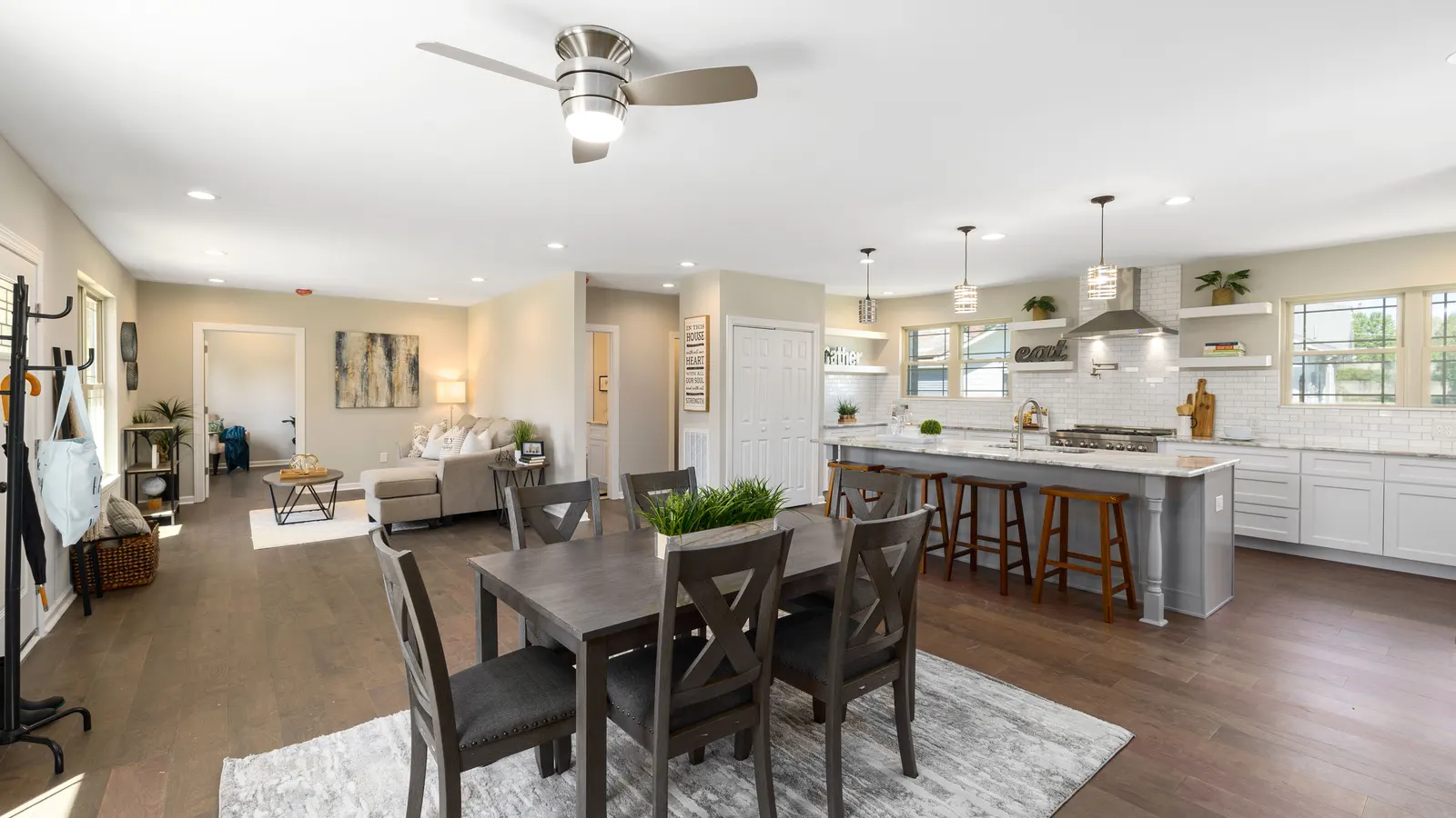
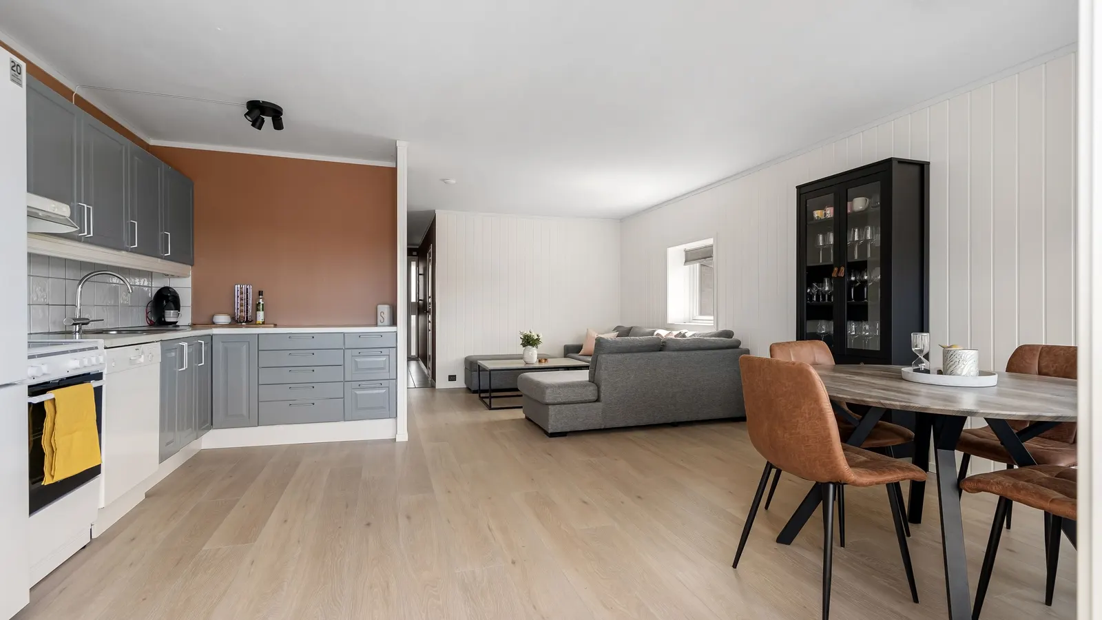
Stand just inside the front door of most houses and you can see three or four rooms at once. The hall color sits right against the living room, and the dining room shows past it. Colors that look fine one room at a time can clash when you see them together. The rooms you see together need one palette.
Kitchen and bath designers are saying it too. The National Kitchen & Bath Association’s 2026 trends report names “whole home continuity” among its themes.
| Figure | What it means for you | Source |
|---|---|---|
| 634 industry professionals across North America gave the feedback behind the report | It’s a survey of designers and remodelers, published on September 16, 2025. It tells you what the trade is seeing, not what any one house needs. | National Kitchen & Bath Association, NKBA/KBIS 2026 Kitchen Trends Report |
| 11 core themes driving kitchen design, one of them “whole home continuity” | The report page adds that “design decisions made in the kitchen now ripple through the rest of the home.” The kitchen’s colors are seen from the rooms around it, so they get planned with them. | National Kitchen & Bath Association, NKBA/KBIS 2026 Kitchen Trends Report |
The full report is sold to the trade, so we cite the theme and leave its numbers out.
Start at the front door
Every color you can see from one spot has to sit well with the others. The views that matter most are from the front door, down the main hall and across an open kitchen. Rooms you close off, like a study or a bedroom, have more freedom. You see them one at a time. They can go darker or stronger.
Does that mean every room has to match? No. Rooms you see together should work together, and that isn’t the same as matching.
What you see from the front door
Illustrative plan, not to scale
-
From the front door you can often see into three or four rooms.
-
The hall and living room sit close together, so moving between them feels like one space.
-
Every color you can see from one spot needs to sit well with the others in that view.
-
In an open kitchen the cabinets, the dining room walls and the hall trim are all in view at once.
-
Rooms you step into and close off are seen one at a time, so they can go darker or stronger.
-
A change usually looks cleanest at a door casing or an inside corner, where there is a natural edge.
One color family, stepped darker
How do you tie connected rooms together without painting them all one color? Keep their colors in one family and step the LRV down as you go. The palette below is an example, with each color’s published LRV.
| Surface and color | Light reflectance value (LRV) |
|---|---|
| Trim: Pure White | 78.94 |
| Hall: Classic Gray | 73.67 |
| Living: Pale Oak | 68.64 |
| Dining: Shakespeare Tan | 47.41 |
| Study: Durango | 12.27 |
Sources (5)
Sources: Benjamin Moore color pages for Pure White OC-64, Classic Gray OC-23, Pale Oak OC-20, Shakespeare Tan 228 and Durango 2137-30, 2026.
The hall and living room are close in LRV and read as one space. The dining room steps down, and the study, which closes off, goes much darker. The trim stays the lightest color everywhere and ties the rooms together. Your palette will look different. What carries over is its shape, with light colors where rooms open into each other and stronger ones where a room stands alone.
Where one color stops
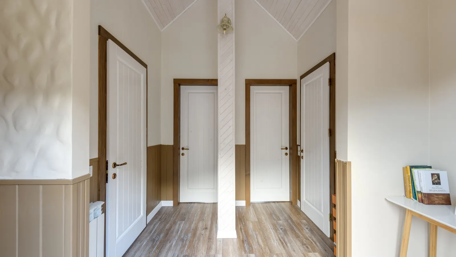
Change colors at a door casing or an inside corner, where there’s a natural edge. A change in the middle of a flat wall, or on an outside corner seen from both rooms, tends to look like a mistake.
Cabinets and trim carry a palette as much as walls do. We run one palette through walls, trim and cabinetry. The kitchen’s cabinet color gets chosen with the rooms you see it from. If the cabinets are staying, our cabinet refinishing page covers changing their finish.
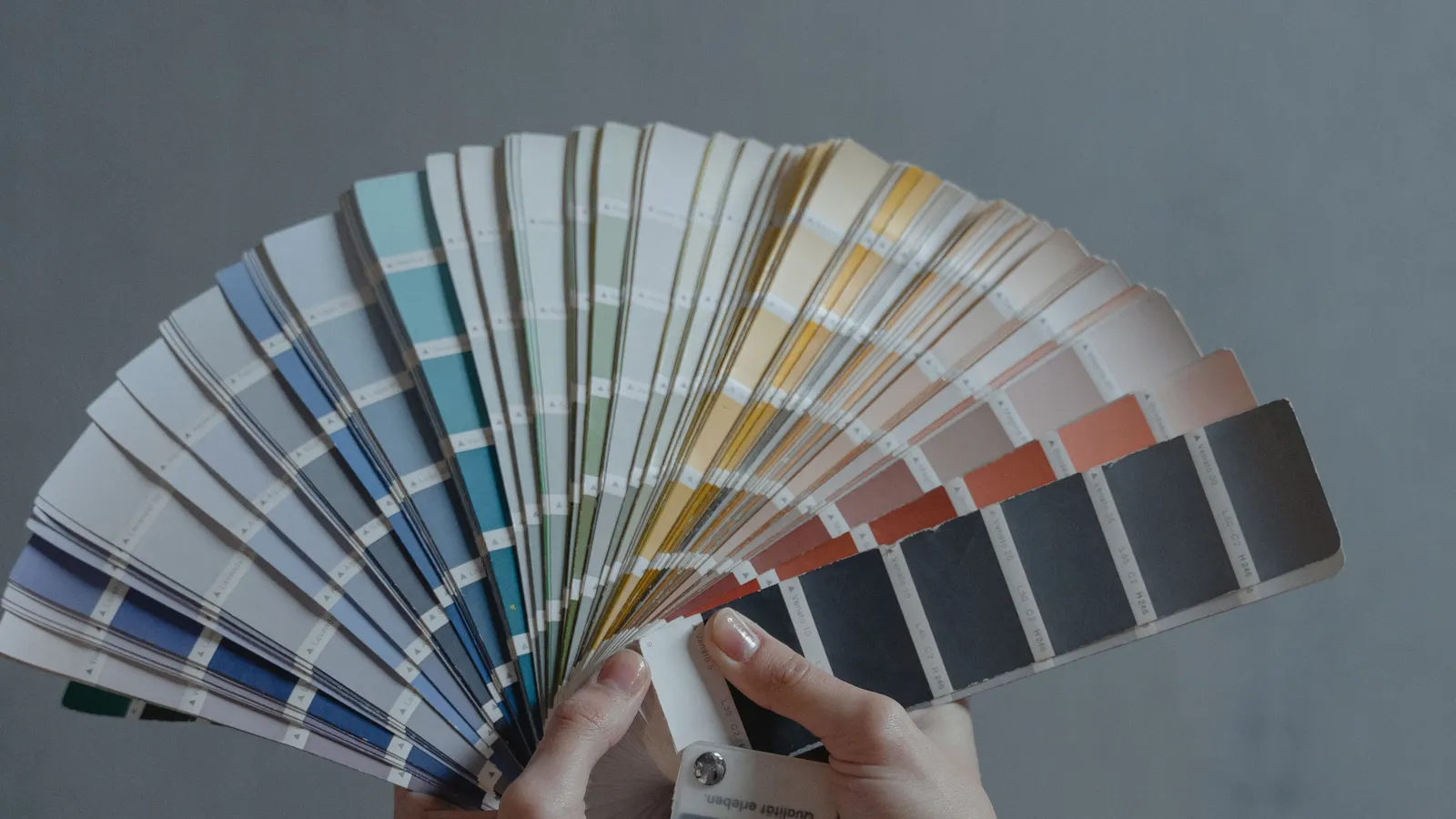
What about rooms you aren’t painting this time? We look at them too. A new hall color has to sit next to the living room you’re keeping, and the colors already on the walls become part of the palette.
Planning the whole house
One palette for the whole house is part of our color consultation, which comes with every painting project at no extra charge. It covers paint colors, sheens and finishes. We’re painters and finishers. Furniture, fabrics and decor stay with you or your designer.
- We walk the house with you, talk about your style and look at the light in each room.
- Large samples go up in several rooms, so you see neighboring colors together.
- We check the colors at different times of day, the way you use each room.
- The palette is confirmed and written down before work starts.
Every room’s colors are settled before the first coat, so nobody picks a hall color on a ladder. Our post on how our color consultation works covers each step.
That’s the last part of the series. If you came here first, Part 1 is about light and Part 2 is about choosing a white. Color consultation comes with the painting work on every interior painting project. To plan your palette, request an estimate or call us at (650) 961-7415.
Sources (6)
- National Kitchen & Bath Association, NKBA/KBIS 2026 Kitchen Trends Report nkba.org (https://nkba.org/research/nkba-kbis-2026-kitchen-trends-report/) Cited 1, 2
- Pure White OC-64 benjaminmoore.com (https://www.benjaminmoore.com/en-us/paint-colors/color/oc-64/pure-white) Back
- Classic Gray OC-23 benjaminmoore.com (https://www.benjaminmoore.com/en-us/paint-colors/color/oc-23/classic-gray) Back
- Pale Oak OC-20 benjaminmoore.com (https://www.benjaminmoore.com/en-us/paint-colors/color/oc-20/pale-oak) Back
- Shakespeare Tan 228 benjaminmoore.com (https://www.benjaminmoore.com/en-us/paint-colors/color/228/shakespeare-tan) Back
- Durango 2137-30 benjaminmoore.com (https://www.benjaminmoore.com/en-us/paint-colors/color/2137-30/durango) Back