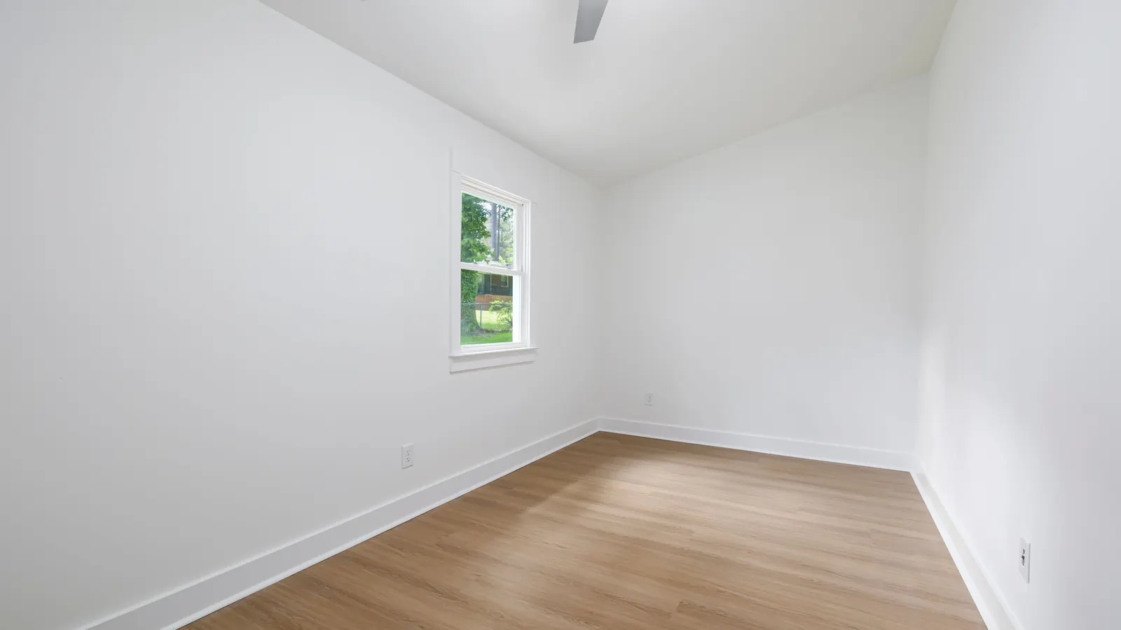
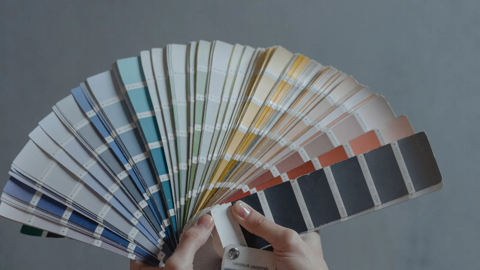
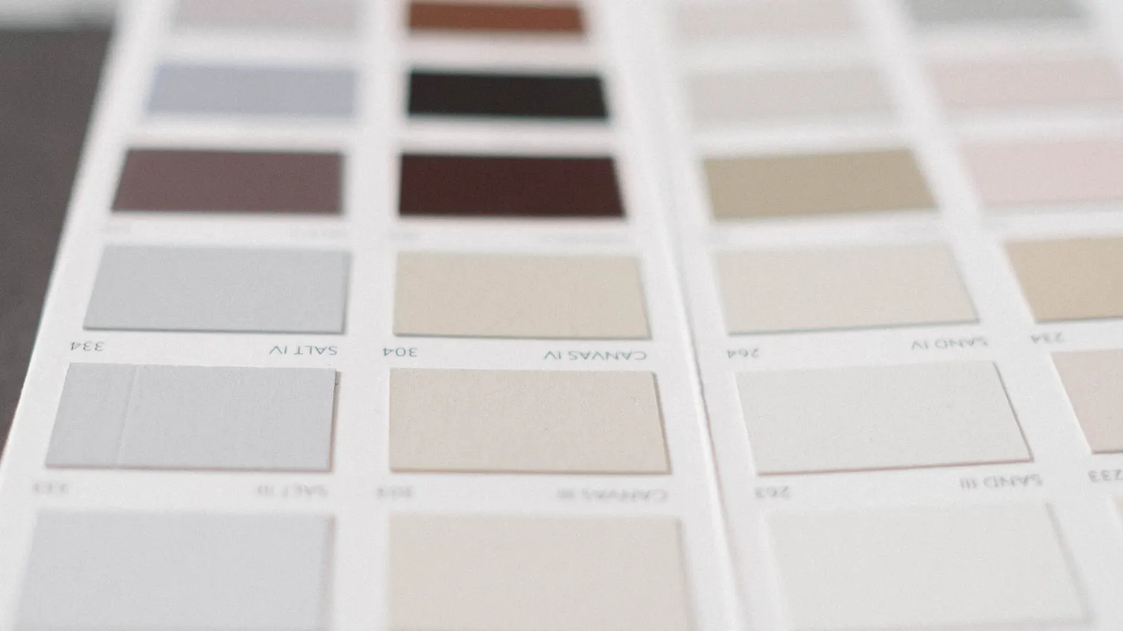
Ask for white at a paint counter and you get a fan of chips that look nearly identical. They aren’t. Most houses have more white than any other color, on the ceilings, trim and doors and often the cabinets and walls. Pick the wrong one and it shows on every one of those surfaces.
How far apart can two whites be? Take seven well known whites from one maker. LRV, from Part 1, is the share of light a color reflects on a 0 to 100 scale.
| White | Light reflectance value (LRV) |
|---|---|
| Chantilly Lace | 90.04 |
| Simply White | 89.52 |
| Super White | 87.36 |
| White Dove | 83.16 |
| Decorator’s White | 82.68 |
| Swiss Coffee | 81.91 |
| White Down | 76.69 |
Sources (7)
Sources: Benjamin Moore color pages for Chantilly Lace OC-65, Simply White OC-117, Super White OC-152, White Dove OC-17, Decorator’s White OC-149, Swiss Coffee OC-45 and White Down OC-131, 2026.
All seven are sold as whites, and they span more than 13 points of LRV. White Down reflects noticeably less light than Chantilly Lace, so it looks softer on a wall. Even two whites a point apart can look different side by side, because LRV says how light a white is. It doesn’t say which way the white leans.
Why one maker? So every number comes from one source. Benjamin Moore prints the LRV on each color’s page. For another brand, check its color page or ask us. As a Fine Paints of Europe Master Certified contractor we can also bring in the Fine Paints of Europe palette and its coatings.
Undertone
That lean, warm or cool, is the white’s undertone, and it’s what you’ll notice once the paint is up. Benjamin Moore says Simply White has “the slightest hint of warmth” and White Down “hints of cream.” Decorator’s White has “a touch of cool gray.”
The room pulls on that lean. A gray-leaning white can look grayer in a north facing room, and warm afternoon light can push a creamy white toward yellow. Wood floors, stone counters and tile do the same from below.
Where the whites go
Illustrative elevation, not to scale
-
It can match the walls, or take a separate ceiling white. We sample both ways and decide in the room.
-
The walls may be a soft white. Wood floors, stone counters and tile pull on its undertone from below.
-
Many houses use one trim white throughout. It ties the rooms together.
-
A glossier finish reflects more light, so the same white often looks a touch brighter on enameled trim and doors.
-
Wall, trim and cabinet whites work together, so we pick them together.
Wall, trim and ceiling, chosen together
A room often has more than one white, and we pick them together, cabinets included. A trim white that looks crisp against a warm wall can look stark against a cool one. Many houses use one trim white throughout, which ties the rooms together, and that’s where Part 3 picks up.
Should the ceiling be the same white as the walls? It can be, and in a room with little light that often looks calm. We sample it both ways and decide in the room.
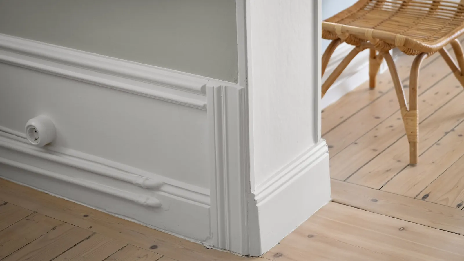
Sheen changes a white as well. The same white often looks a touch brighter on glossy trim and doors than flat on a wall, so we choose the sheen with the color. Our paint finish guide goes through the options.
Testing whites at home
Whites get the same color consultation as any other color, and it comes with every painting project at no extra charge.
- First we talk about your style and look at the light in each room.
- Large samples of the whites you’re considering go on your own walls, in several rooms.
- We come back to them at different times of day, the way you use each room.
- Before work starts we write the palette down. Every surface gets the white you chose.
Test two or three whites side by side. On its own a white just looks white. Next to another, the undertones show right away.
Is the brightest white the right one? Not necessarily. A very bright white can look stark in strong south light, and in a dim room even a high LRV white can look gray.
Whites are where most palettes start. Carrying one palette from room to room is Part 3, on carrying one palette through the house. Color consultation comes with the painting work on every interior painting project. To get started, request an estimate or call us at (650) 961-7415.
Sources (7)
- Chantilly Lace OC-65 benjaminmoore.com (https://www.benjaminmoore.com/en-us/paint-colors/color/oc-65/chantilly-lace) Back
- Simply White OC-117 benjaminmoore.com (https://www.benjaminmoore.com/en-us/paint-colors/color/oc-117/simply-white) Back
- Super White OC-152 benjaminmoore.com (https://www.benjaminmoore.com/en-us/paint-colors/color/oc-152/super-white) Back
- White Dove OC-17 benjaminmoore.com (https://www.benjaminmoore.com/en-us/paint-colors/color/oc-17/white-dove) Back
- Decorator’s White OC-149 benjaminmoore.com (https://www.benjaminmoore.com/en-us/paint-colors/color/oc-149/decorators-white) Back
- Swiss Coffee OC-45 benjaminmoore.com (https://www.benjaminmoore.com/en-us/paint-colors/color/oc-45/swiss-coffee) Back
- White Down OC-131 benjaminmoore.com (https://www.benjaminmoore.com/en-us/paint-colors/color/oc-131/white-down) Back