Oscar Wilde lay dying in a Paris hotel room in 1900. His reported last words: "Either the wallpaper goes, or I do." That wallpaper likely contained Scheele's Green, an arsenic pigment that released toxic vapors when damp. The beautiful colors of Victorian and Arts & Crafts homes could kill.
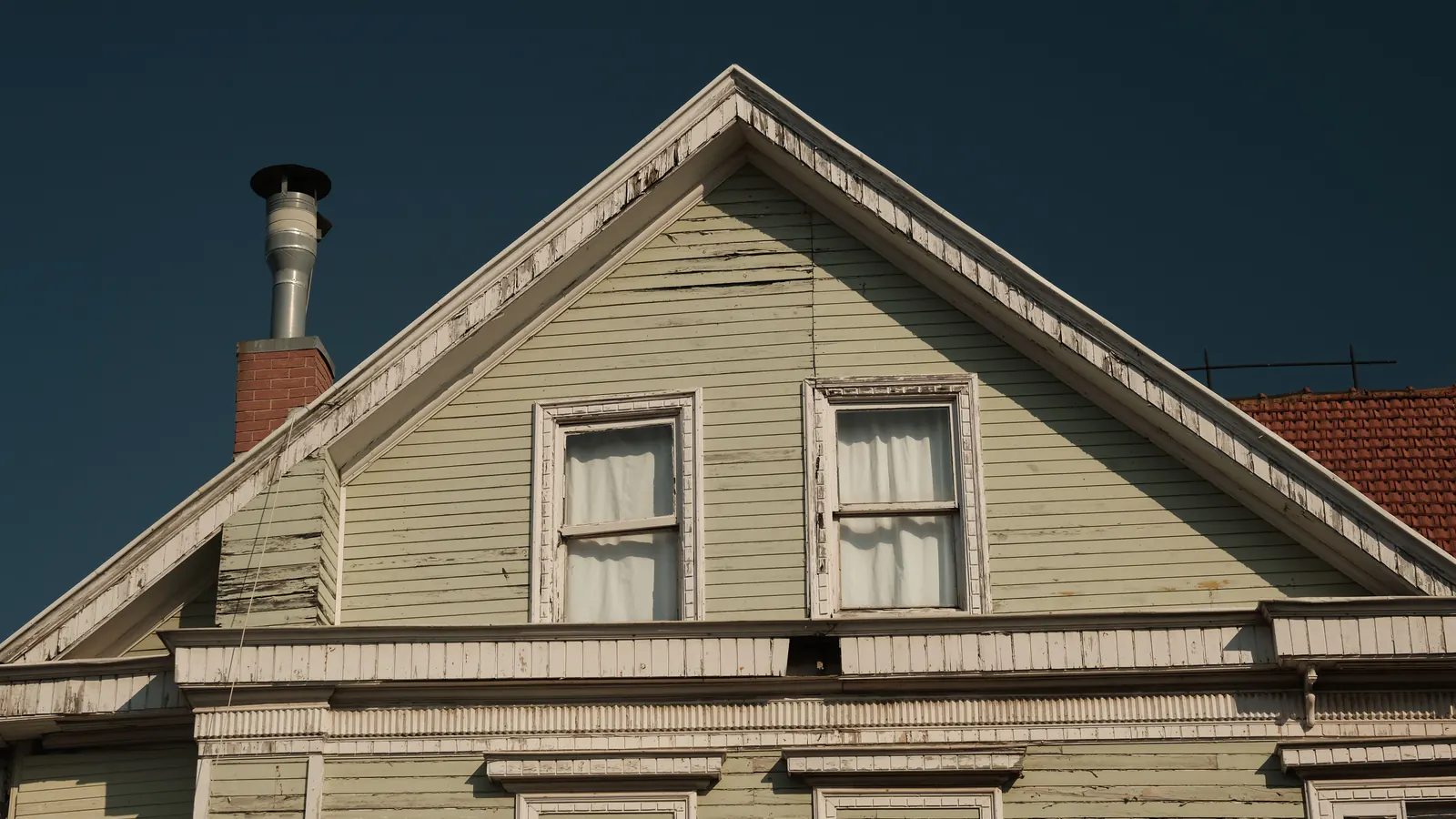
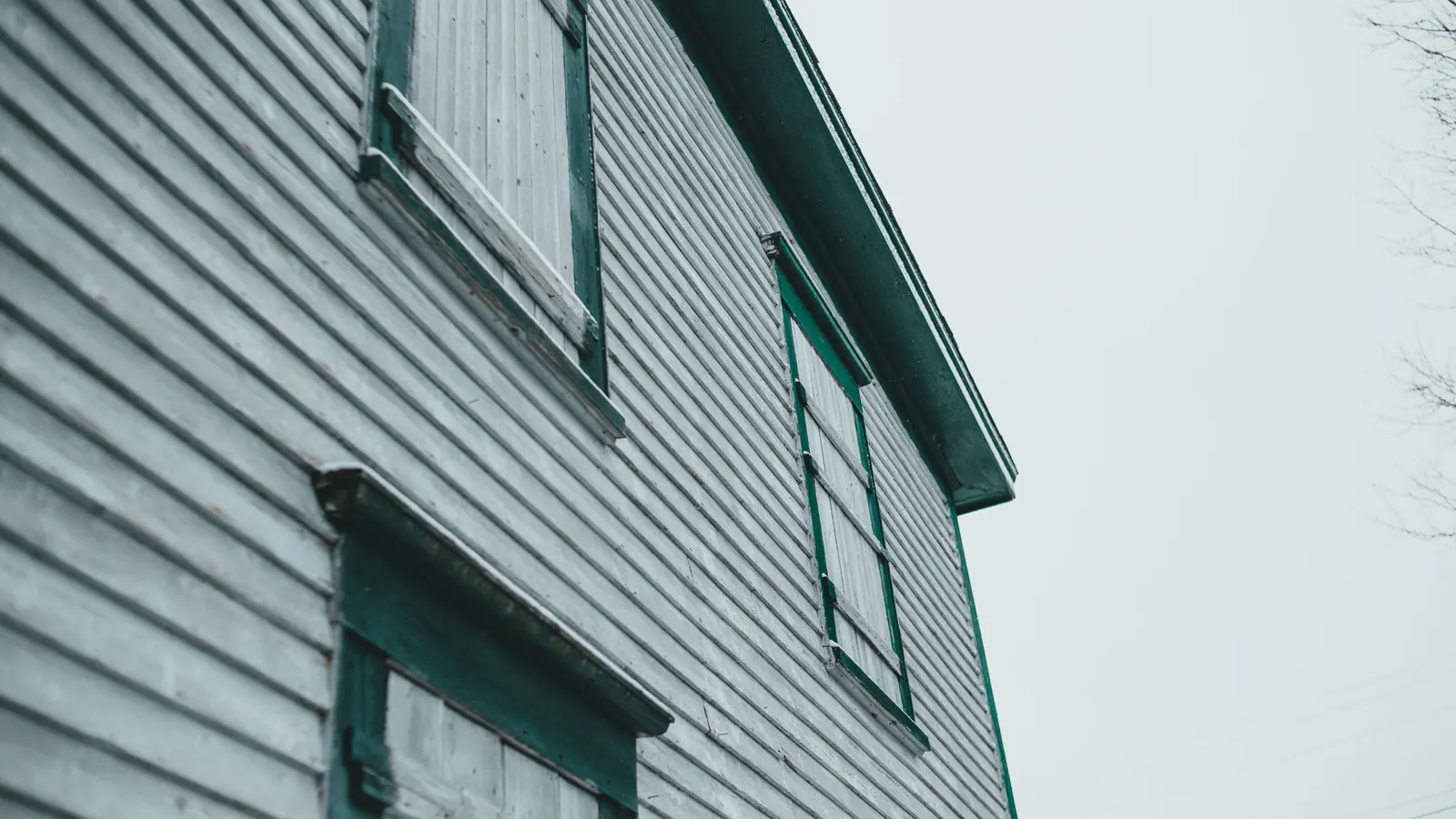
Paris Green (copper acetoarsenite), invented in 1775, was highly toxic but popular for shutters and trim because the arsenic acted as a wood preservative and insecticide. Victorians painted shutters green to repel mosquitoes, unknowingly coating their homes in poison. The green that gives historic homes their character was once a genuine health hazard.
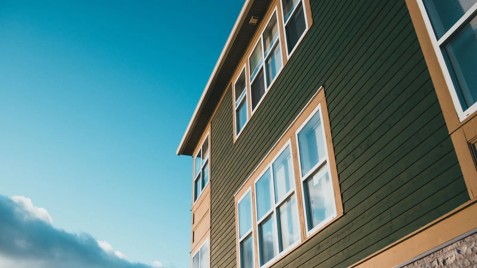
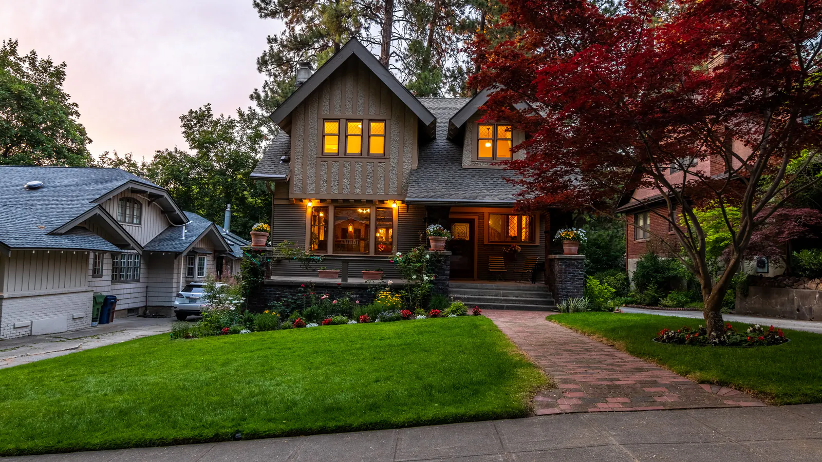
The Arts & Crafts movement, which gave us the Craftsman bungalow, was partly a reaction against such industrial excess. Gustav Stickley's The Craftsman magazine promoted earth tones drawn from autumn landscapes: olive, dark green, russet, sage, tan, golden yellow, all in service of "honest" materials and harmony with nature. Peninsula homeowners with Craftsman bungalows in Professorville, Allied Arts and older Redwood City neighborhoods now get to choose colors that honor that heritage with modern, safe paints.
Peninsula History Note
The "haint blue" porch ceiling tradition comes from Gullah Geechee culture in the coastal South. "Haint" refers to restless spirits that cannot cross water. Pale blue porch ceilings were painted to mimic water, keeping spirits at bay. Victorians also favored the color because it mimicked daylight, extending the usable hours on the porch before electric lighting.
Authentic Craftsman Color Theory
Craftsman color schemes followed clear principles from the Arts & Crafts philosophy:
Body Colors: Earth tones that blend with natural surroundings. The goal was harmony with the landscape, not contrast against it.
Roof Integration: Body colors must complement the roof, the largest color area on most homes. Brown roofs pair with olive and green; green roofs with warm browns and reds. Ignore the roof and the scheme will clash.
Trim Contrast: Trim was historically medium contrast to the body, not dark-on-dark, typically one main trim color plus perhaps a secondary accent. That restraint gives the style its cohesive, grounded look.
Window Sash: Sash was often painted a different color from trim for depth. Modern repaints often skip this detail, and it makes a real difference in authenticity.
The Haint Blue Porch Ceiling
Southern Craftsman homes often have pale blue porch ceilings, for several reasons:
- Spiritual protection: The Gullah Geechee belief that spirits can't cross water
- Practical extension of daylight: The color mimics sky, making porches usable longer
- Wasp deterrence: Some claim the color discourages wasp nests (anecdotal)
Haints or not, a pale blue porch ceiling is a charming, historically appropriate detail for Peninsula Craftsman homes. Benjamin Moore's "Palladian Blue" or Sherwin-Williams' "Rainwashed" are good modern equivalents.
Specific Palette Recommendations
Several manufacturers offer historically accurate Craftsman palettes:
| Manufacturer | Collection | Notable Colors |
|---|---|---|
| Sherwin-Williams | Historic Collection | Renwick Rose Beige, Pewter Tankard, Rookwood Dark Red |
| Benjamin Moore | Historic Colors | Wethersfield Moss, Louisburg Green, Audubon Russet |
| California Paints | Historic Colors of America | Period-appropriate regional palettes |
| Sherwin-Williams | Master Painter (1887) | Portabello, Watery, Drizzle |
The Master Painter colors were formulated in 1887 and are still sold today, about as authentic as it gets without mixing your own pigments.
Peninsula-Specific Considerations
Existing materials on Peninsula Craftsman bungalows shape color selection:
- Clinker brick: The irregular, dark bricks common in Peninsula Craftsman homes have warm tones that pair well with olive and sage greens
- River rock foundations: Gray-brown stones call for cooler body colors with warm trim accents
- Dark wood wainscoting: Natural redwood or cedar requires colors that complement rather than compete
- Redwood shingles: Weathered redwood has a silver-gray patina that influences the overall palette
On a Craftsman in Professorville or Allied Arts, we look at these materials before recommending colors. The goal is a cohesive whole, not paint that fights the architecture.
The Low Contrast Rule
Excessive contrast is one of the most common mistakes we see on repainted Craftsman homes. Bold trim against a dark body suits modern taste, but it isn't historically accurate and can make a Craftsman look cartoonish.
Aim for medium contrast: trim noticeably different from the body but not jarring. Think sage green body with cream trim, not olive body with white trim.
Our Recommendation
For Peninsula Craftsman bungalows:
- Start with the roof: Your body color must work with the roof, not against it
- Consider existing materials: Brick, stone, and wood all influence the palette
- Use historic color collections: They've done the research; trust their expertise
- Keep contrast moderate: Avoid the high-contrast look that's trendy but inauthentic
- Don't forget the porch ceiling: Haint blue is a charming and appropriate detail
- Test before committing: Colors look different in natural light than on paint chips
Whether you're restoring a 1910 bungalow in Professorville or updating a 1920s cottage in Menlo Park, the right colors make a Craftsman look like it grew from the landscape, which is exactly what its architects intended.
"Craftsman color palettes succeed through restraint. The right green or ochre should feel inevitable, not imposed."